Editor’s Note: Read more unknown and curious design origin stories here.
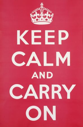
Keep calm and carry on: a quintessentially British phrase that has been exported and imprinted the world over.
But before becoming a viral meme, this remnant of World War II was first overlooked and then forgotten for over 60 years.
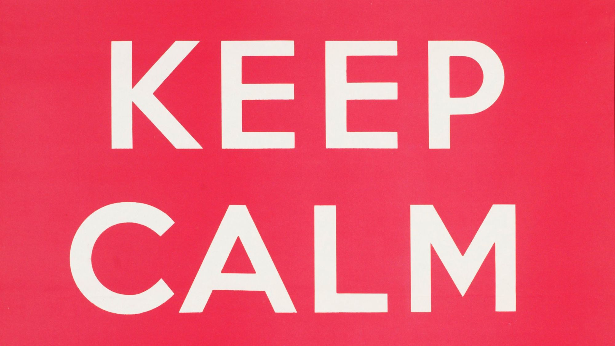
It was created in 1939 as part of a series of three posters, and although 2.5 million copies were printed, they were never actually used: “While the other two were put up as soon as they came off the printer, this one was held back in expectation of bombardments or an invasion,” said the author of a new book titled “Keep calm and carry on: The truth behind the poster” Bex Lewis during a phone interview.
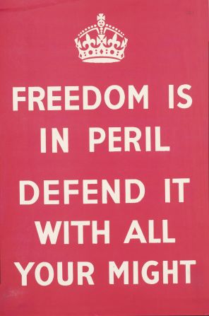
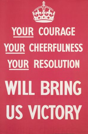
The other two posters carried the not quite so catchy “Your courage, your cheerfulness, your resolution will bring us victory,” and “Freedom is in peril. Defend it with all your might.” The public’s reaction wasn’t great, and by the time the blitz started, it was decided that the third poster had the wrong kind of message: “There was a fear that morale would fall apart, but it turned out that people didn’t need to be told to keep their chins up – they just wanted to be told what to do,” said Lewis.
Keep calm: The story behind the poster
An unusual design
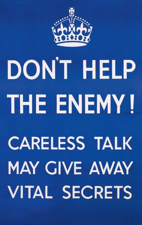
The Ministry of Information, the wartime institution which commissioned the design, laid down some simple ground rules: the design had to stand out from posters issued by other departments, it had to use a “special and handsome type” and “bear a distinctive uniform device” making it “difficult or impossible for the enemy to print reproductions” – which is ironic given the ultimate fate of the poster.
The sleek result was a collaboration between different civil servants, with words from speechwriter A.P. Waterfield and a graphic design by illustrator Ernest Wallcousins. According to design expert Stephen Bayley, founder of London’s Design Museum, it worked: “In an unlikely wartime victory, the Ministry of Information achieved an ironic detachment and a stylish stoicism beyond the reach of advertising professionals of the day,” he said in an email.
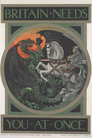
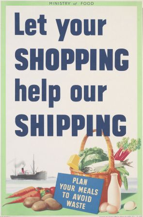
The poster must have looked unusual at the time, according to Lewis: “It was designed to look like a proclamation from the king. If you look at German propaganda posters from WWII, it’s got a really clear aesthetic that you would recognize them form a mile away, but British design was more of a hotchpotch, with really old fashioned elements.”
For this series, the creators talked to London Transport, who were at the forefront of design at the time, and used a typeface closely inspired by the one that’s still used for the London Underground: “The one in the poster is very similar to it, which made it look very new, clean and uncluttered.”
That didn’t save the posters from criticism, directed especially at the wording of the “Courage” version, which supposedly created a “you/us” separation between the people and the government. The press wasn’t impressed: “A Daily Mail journalist declared he had walked past the poster for six weeks and still couldn’t remember the slogan,” said Lewis.
Finally, the bright red color gave some the idea that the posters were pieces of Communist propaganda. Because of all this, and notwithstanding the significant print costs of £45,000 – about $3.5 million in today’s money – the “Keep Calm” version never left the warehouses.

A place behind the till
It’s unclear what happened to the posters, but paper was scarce during the war, particularly after 1943,so it’s likely that most were pulped and recycled.
A few survived, and one of them was at the bottom of a box of books bought at an auction in 2000 by Stuart Manley, co-owner with his wife Mary of Barter Books, a second-hand bookshop in the city of Alnwick, in the north of England: “When he found it, he really liked it and decided to frame it and put it up in his shop, behind the till, where it still is.”
Manley and his wife thought it evoked a particular kind of Britishness, a stiff upper lip resolution, and other people thought the same: “Customers came in the shop and started offering to buy it, so he decided to print 50 copies of it. He checked that the copyright was clear and it turned out that it was because he owned an original and more than 70 years had passed from the design, so he could legally make copies of it,” said Lewis.
Manley’s printer said it wasn’t worth making less than 500, so he did and started a small but steady trade.
The financial crisis
The poster had started its second life. From that humble beginning, it slowly picked up steam: “In 2005 the Guardian picked up on it, and 9,000 copies were sold in the next month. By 2007 the figure was over 50,000.”
Another boost came from British celebrities such as Chris Evans and James May, who wore T-shirts with the design, and then Prime Minister Gordon Brown, who was said to have it on his office wall.
But the event that really made it into a global sensation, according to Lewis, was the financial crisis of 2008: “It really went huge in 2009 after the crisis, which is when it started selling strongly in America too. The fact that it was free to use and out of copyright helped its digital distribution, without which it might have remained a regional phenomenon.”
The message had found its purpose: not as a call to order in the wake of a Nazi invasion, but as a quirky encouragement in the face of economic disaster. Since then, the statement has proven to be continuously popular: “Every time we have any kind of crisis of some sort, I get a Google Alert for the term. Some people read the message as give up and let everything happen, but I see it as a call to resilience and seeing things through,” said Lewis.
The design is now as easy to find in London souvenir shops as the Union Jack. Its countless variations and adaptions have found their way into almost every conceivable human endeavor. And with no shortage of crises, it will likely carry on.
“Keep calm and carry on: The truth behind the poster,” by Bex Lewis, is out now.

