Story highlights
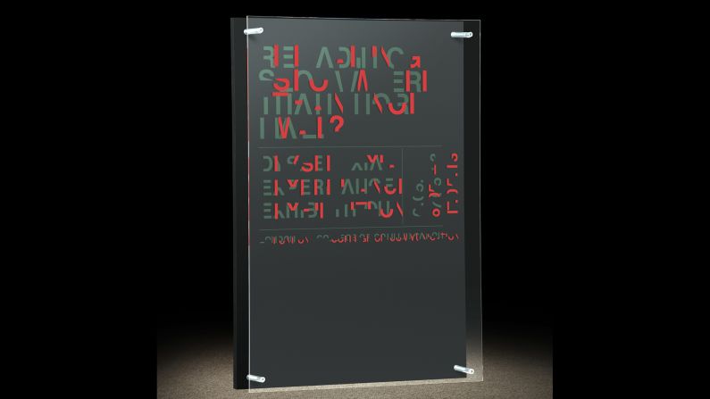
New typeface makes readers slow down and simulates the difficulty dyslexic people have reading
Daniel Britton uses his personal experience with dyslexia to advocate for more empathy
Not until he was a 22-year-old university student did Daniel Britton finish reading a book.
He is not lazy or a slow learner, as prior teachers had believed. He is dyslexic.
The labels placed on Britton as a child are not uncommon. Language-based learning disabilities affect 1 in 5 students, and dyslexia is the most prevalent. Yet the disorder is widely misunderstood.
“People who’ve never been dyslexic don’t understand what it’s like,” said Britton, who lives in Hartley, England. A graphic designer, he is now using his creative talents to create greater awareness and empathy for those with dyslexia.
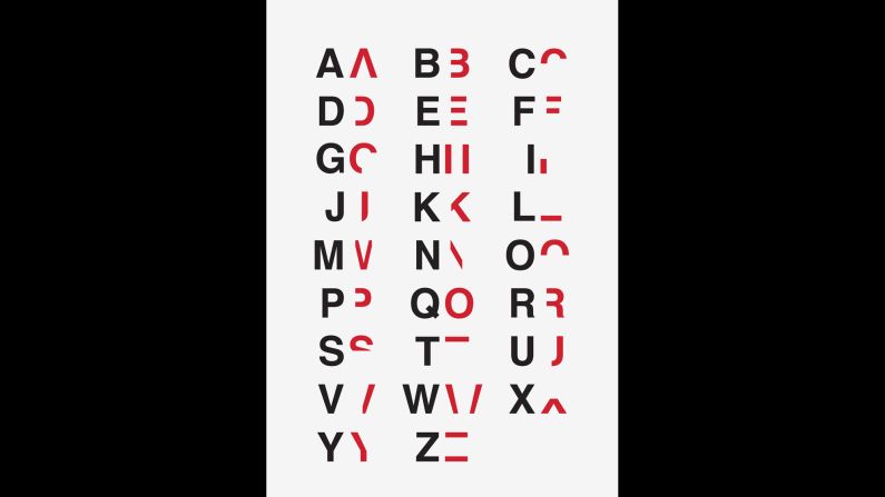
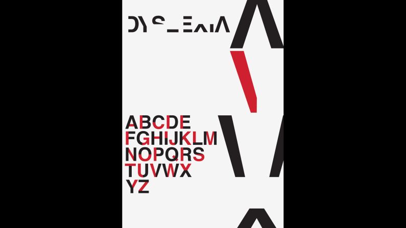
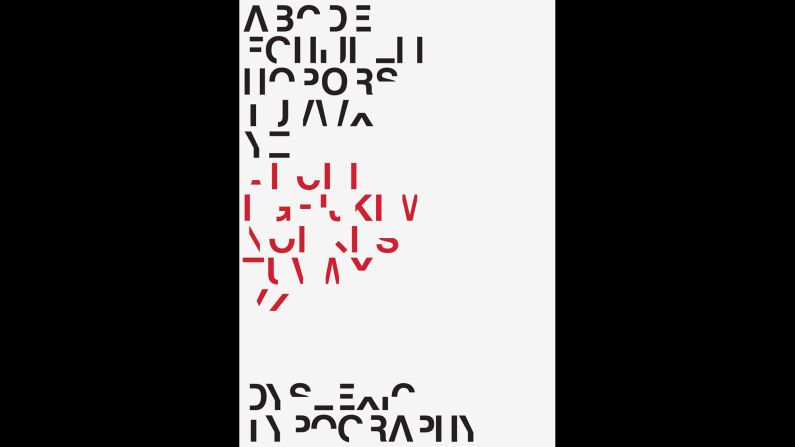
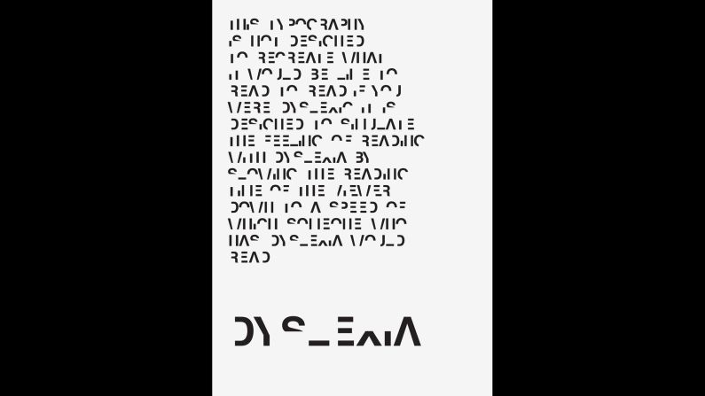
To do this, he designed a typeface that is intentionally difficult to read. Because it slows down reading time, it’s meant to simulate how it feels to read with dyslexia. While individuals with the disorder generally have standard vision, they have difficulty relating speech sounds to written words.
This creates a barrier to learning. Britton, like many dyslexic students, failed tests. The 15 additional minutes he was granted for exams did not help because he could not read the questions. He retook math and English courses multiple times. At 18, his reading level matched that of a 10-year-old.
Britton’s lack of success in school left him with limited options, so he pursued a career in the one class where he excelled: graphic design. The typeface he designed began as a self-initiated project for school. When he submitted it to the online architecture and design magazine designboom, he did not expect his work to make it past the competitive submission process.
The next morning, however, his email was flooded with responses and media requests. Not only had designboom published his work – his typeface also resonated with audiences.
“I had no idea it would be globally accepted in the course of a few days,” he said.
Britton’s work has been recognized this month by national and international media. But the most gratifying responses he received were thank yous from people who now have a way to explain their struggles to their non-dyslexic friends and family members.
These messages motivated him to start a Crowdfunder campaign to create educational packs of his work. The packs will be sent to schools around the world that want to use the typeface. He wants to raise 2,000 British pounds (about $3,163.60) to cover production and shipping costs until revenues make the project self-sustaining.
Each pack will include posters and booklets featuring the typeface. It is aimed to educate parents and teachers who do not understand dyslexia. Britton is targeting both groups because he believes both are crucial in supporting a dyslexic student’s education.
“This is everyone’s responsibility,” he said. “This whole pack needs to help everyone in one hit.”
If people have a greater empathy for dyslexia, the learning disorder can be identified faster, and treated more effectively, allowing students to learn at the same pace as their peers, Britton said. For instance, dyslexic children learn better using audio or visual styles instead of text.
And for them, equal education means equal opportunity.
“I would’ve liked to have had more options when I was younger,” he said. “If it (my disability) was picked up earlier or treated correctly, who knows what I could’ve done.”
Even so, Britton would not choose to live without dyslexia. Instead, he thinks his experience can help people who have long been misunderstood. This is why he wants the packs to reach as many schools as possible, as quickly as possible.
“If I could help them, that’d mean everything,” he said.
